Why Some Booths Attract Crowds: The Science Behind Visual Attention
The Painful Reality No One Talks About
You've done the work. Booked the space. Shipped the materials across the country. Your team flew in Thursday night, and everyone's wearing matching shirts.
And now you're just... standing there.
People walk by. They don't even glance. It's like you're furniture. Meanwhile, three rows over, there's a booth with a crowd six people deep. They aren't giving away cars or hiring models. They just have something you don't.
What is it?
I've spent the last decade covering trade shows for various publications. I've walked hundreds of floors. And I keep seeing the same pattern. The booths that win aren't always the biggest or the most expensive. They understand something fundamental about how humans actually see.
This isn't about luck. It's about science.
The Problem: Your Brain Has a Spam Filter
Here's the thing nobody tells you when you sign up for exhibition space. The human brain is not designed to pay attention. It's designed to ignore.
Every second, your eyes take in roughly 10 million bits of visual information. But your conscious mind can only process about 40 bits. That means 99.9996% of what you see gets filtered out before you're even aware of it.
Think about that for a second.
Your beautiful booth display with the perfectly chosen colours and carefully crafted messaging? Most people's brains are categorising it as "irrelevant" before they consciously register it exists.
This is called selective attention. And it's the reason why two exhibitors can have nearly identical products, similar budgets, and the same floor location—yet one draws crowds while the other watches tumbleweeds roll by.
The difference isn't what they're selling. It's how they're presenting it to the human visual system.

The Analysis: What Actually Captures Attention
So what makes the brain stop filtering and start focusing?
Neuroscientists have been studying this question for decades. And the findings are surprisingly consistent. Our attention is captured by a handful of specific visual triggers. If your booth design doesn't activate these triggers, you're essentially invisible.
Contrast breaks the pattern.
Your eyes are constantly scanning for things that don't fit. It's an evolutionary hangover from when noticing the odd shape in the bushes meant the difference between eating dinner and becoming dinner.
At a trade show, this means your booth needs to look different from its neighbours. Not just a little different. Noticeably different. If everyone else has blue banners, maybe yours should be orange. If everyone uses horizontal layouts, consider going vertical.
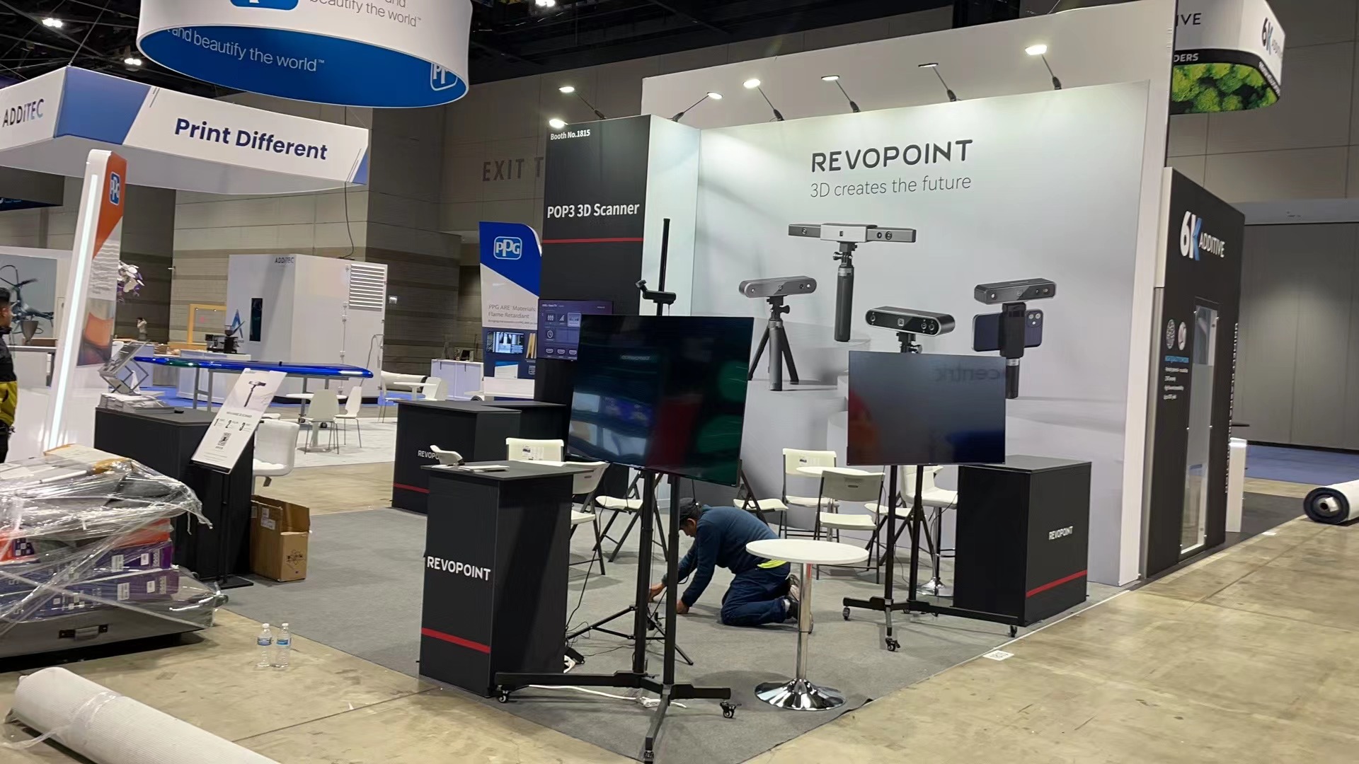
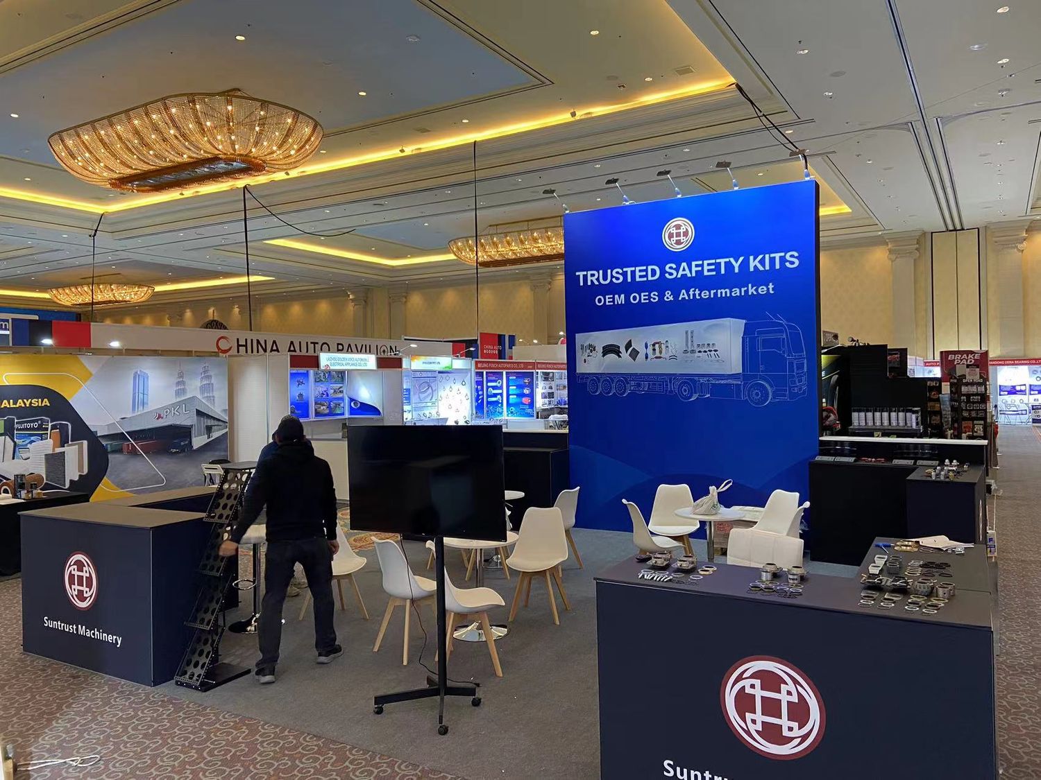
I walked a tech expo last spring where every single 10x10 tradeshow booth had the same basic setup. Pop-up backdrop, table in front, brochures in a rack. Except one. They'd removed the table entirely and put a single product on a pedestal with a spotlight. Nothing else. People stopped because their brains couldn't ignore the visual disruption.
Motion hijacks the eye.
We can't help it. Movement in our peripheral vision triggers an automatic response. It's why digital screens with subtle animation outperform static graphics almost every time.
But here's the catch—too much motion creates the opposite effect. If everything is moving, nothing stands out. One element with gentle, purposeful movement is far more effective than a screen full of aggressive transitions.
Faces are magnetic.
Humans are hardwired to look at faces. It's called the fusiform face area, and it's a dedicated region of the brain that activates whenever we see anything resembling a human face.
Some exhibitors use this by having large portrait photography in their booth display. Others suggest that simply having friendly, visible staff positioned at the front works just as well. Either way, faces draw eyes. Use that.
Simplicity wins every time.
This one hurts because it goes against every instinct. When you're paying thousands for a booth setup, you want to maximise the real estate. Show everything. List every feature. Mention every client.
Don't.
Cognitive load research consistently shows that more information leads to less engagement. When the brain encounters complexity, it disengages to conserve energy. Your carefully designed graphics with twelve bullet points and three different product lines? People's eyes are sliding right off it.
The booths that stop traffic usually have one bold image, one clear message, and plenty of empty space. That's it.
The Suggestion: Practical Fixes That Actually Work
Knowing the science is nice. But what do you actually do with it?
I've talked to dozens of exhibitors who've cracked this code. Here's what they consistently recommend.
Start with the three-second test.
Stand twenty feet from your booth design mockup. Can someone understand what you do in three seconds or less? Not the nuances. Not the features. Just the core offering.
If you can't pass this test, simplify until you can. Everything else is noise.
Create a visual anchor.
Every successful booth has one element that dominates. Maybe it's an oversized product replica. Maybe it's a striking piece of artwork. Maybe it's a demonstration area with good lighting.
Whatever it is, it should be the first thing people see. Everything else supports it.
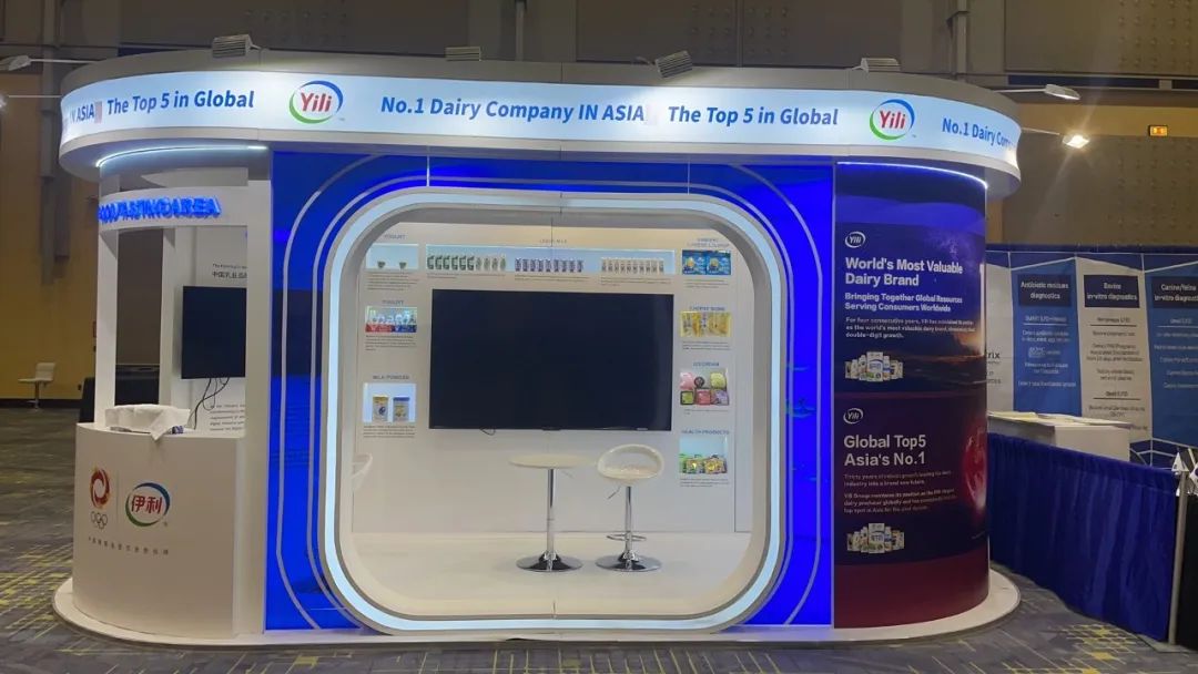
For a standard 10x10 tradeshow booth, this might be a single backlit image that takes up 70% of your back wall. Or a physical product display raised on a platform with dedicated lighting. The key is commitment. Half-measures don't work.
Engineer the approach.
Most exhibitors set up their booth and then hope people wander in. Better exhibitors think about the attendee's path.
Where are people coming from? What angle will they first see your space? What's directly across the aisle competing for their attention?
Your booth setup should be designed for that specific viewing angle. Not for how it looks in a rendering. Not for how it photographs. For how it appears to someone walking the floor at 3 PM on day two when their feet hurt and they've already seen 200 booths.
Use lighting like a weapon.
Exhibition halls are designed for even, flat illumination. This is terrible for standing out.
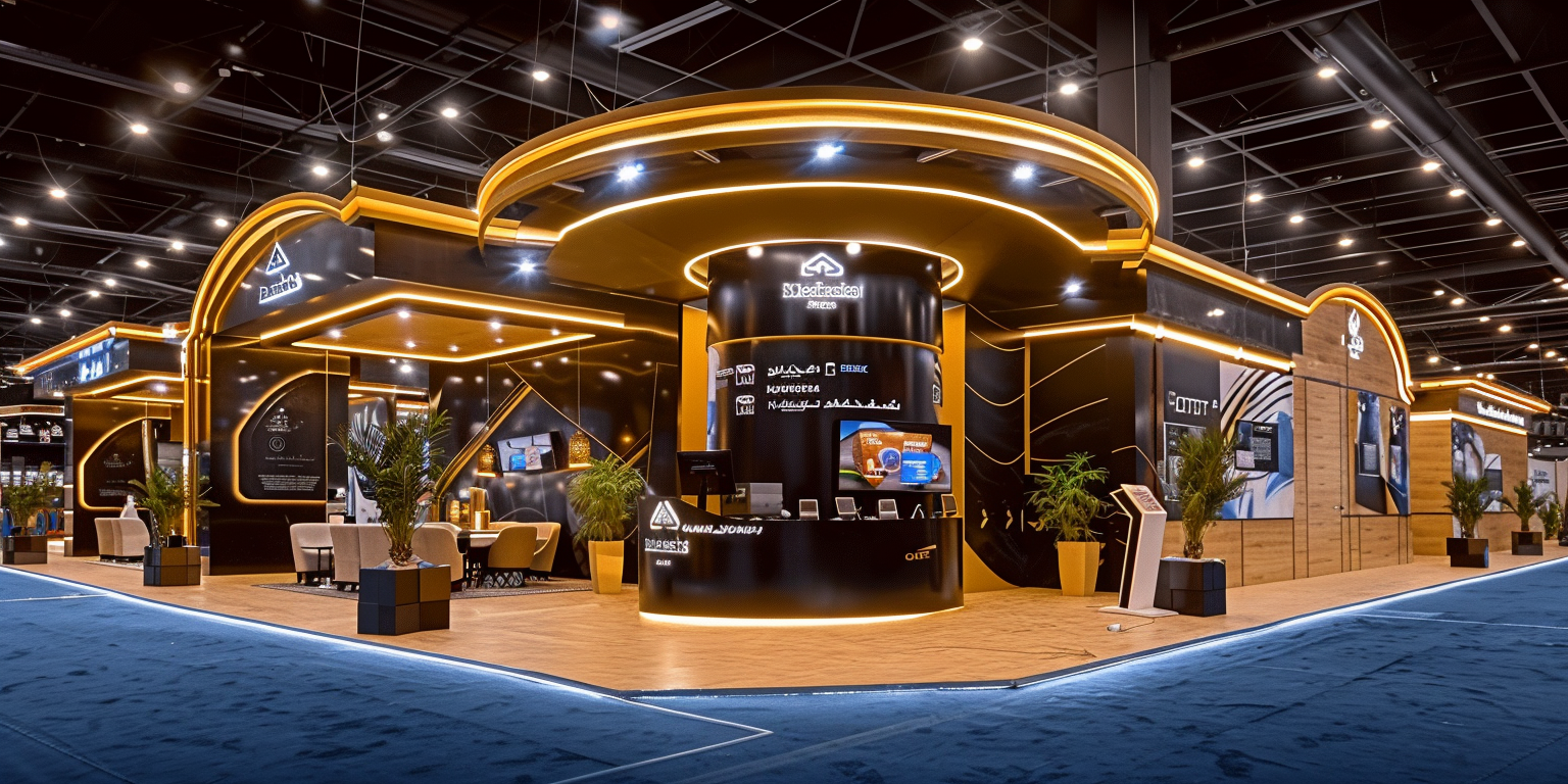
The best exhibitors bring their own lighting. Spots, backlights, accent fixtures. They create contrast and depth that the overhead fluorescents can't provide.
If you look at booths that consistently draw crowds, they're almost always better lit than their neighbours. This isn't coincidence. Light attracts the eye in the most literal sense possible.
Remove the barriers.
Tables across the front of your booth create a psychological wall. Clutter on the floor makes the space feel cramped. Staff standing with arms crossed signal "stay away" even if that's not the intention.
Open your booth display to the aisle. Create obvious entry points. Position your team to the side rather than blocking the centre. Make it physically and psychologically easy to step inside.
The Uncomfortable Truth
Here's what I've learned after years of covering this industry. Most exhibitors don't fail because of bad products or weak marketing. They fail because they design for themselves instead of for the attendee's brain.
They choose colours they like. They include information they think is important. They create layouts that make sense to them.
But trade show success isn't about what makes sense. It's about what captures attention. And attention follows specific, predictable rules.
The science is clear. Contrast triggers interest. Simplicity enables processing. Motion captures the eye. Faces create connection.
Every booth that consistently draws crowds is leveraging these principles, whether consciously or not. The ones that struggle are fighting against them.
You can spend more money. Get a bigger space. Hire flashier staff. But if your booth design doesn't respect how human attention actually works, you'll keep getting the same results.
Or you can learn the rules and play a different game entirely.
References
Kahneman, D. (2011). Thinking, Fast and Slow. Farrar, Straus and Giroux.
Itti, L., & Koch, C. (2001). Computational modelling of visual attention. Nature Reviews Neuroscience, 2(3), 194-203.
Pieters, R., & Wedel, M. (2004). Attention capture and transfer in advertising: Brand, pictorial, and text-size effects. Journal of Marketing, 68(2), 36-50.
Exhibit Surveys Inc. (2019). Trade Show Effectiveness Research Report.
Center for Exhibition Industry Research (CEIR). (2022). The Role of Design in Attendee Engagement.


