Minimalist vs. Flashy Booth Design: Which Attracts More Visitors?
You’re standing on the expo floor. Your feet hurt. You’ve spent three months and a significant chunk of your marketing budget on this event. But as the crowd moves past, they aren’t stopping. They glance, maybe slow down for a millisecond, and then drift toward the competitor across the aisle.
It’s the nightmare scenario.
The biggest question I get asked when companies start prepping for a show isn't about the swag or the sales script. It’s about the booth design. Specifically, the vibe. Do we go loud, flashy, and aggressive? Or do we strip it back, go minimalist, and look like the Apple Store of our industry?
There is a massive misconception that "more is better." You see people cramming monitors, banners, and heavy machinery into a standard 10x10 tradeshow booth, thinking that if they just show everything, someone will buy something.
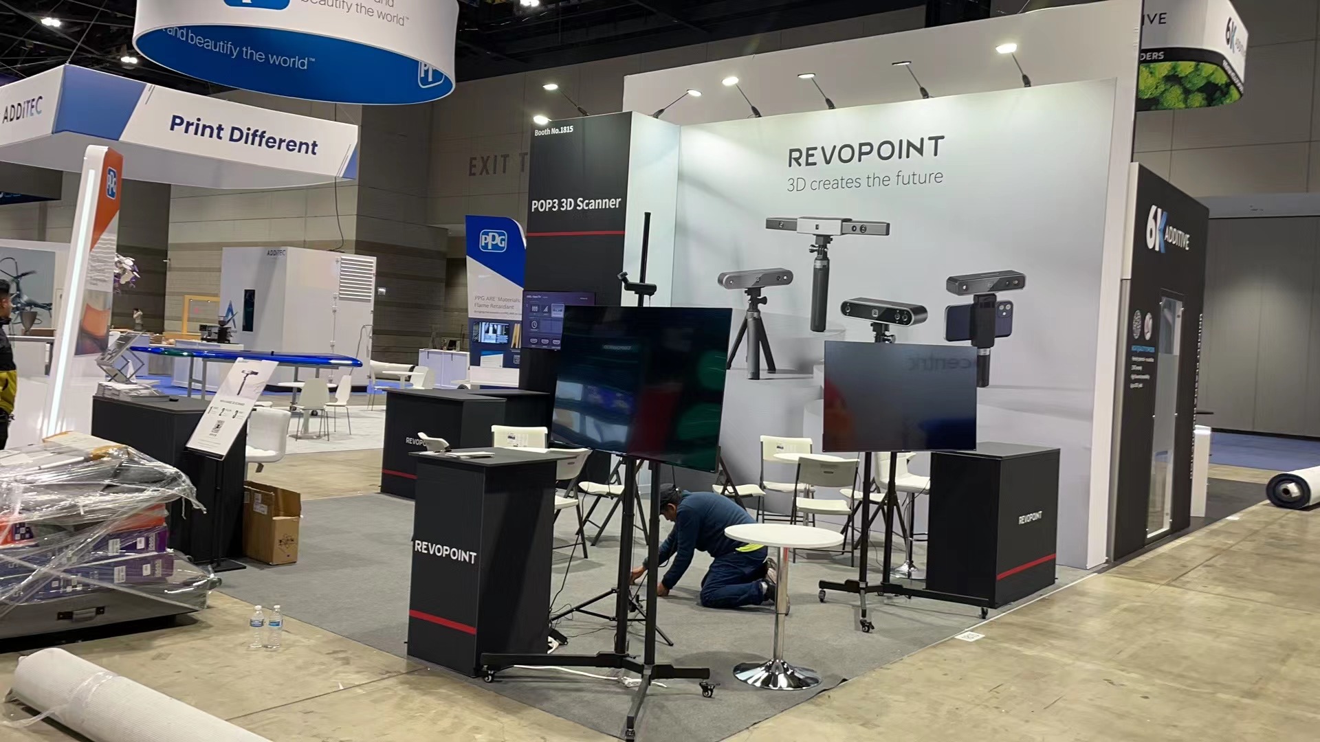
On the flip side, you have the minimalists. They read a blog post about "negative space" and decided to put a single chair and a logo in the centre of the carpet. Then they wonder why attendees assume they’re still setting up.
The challenge isn't just about aesthetics; it’s about cognitive load. Trade shows are chaotic. It’s sensory overload. If your booth setup contributes to the noise, you lose. But if you’re too quiet, you disappear.
We need to figure out which approach actually gets people to stop walking and start talking.

Analysis: The Battle for Attention (and Retention)
Let’s break this down objectively. I’ve watched thousands of interactions on trade show floors, and the data usually points to a specific truth: Attention is cheap, but engagement is expensive.
The Case for "Flashy"
There is a time and place for the "shock and awe" approach. If you are launching a brand new product that nobody has ever seen, or if you are in a highly commoditised market (like energy drinks or cheap consumer electronics), you need to shout.
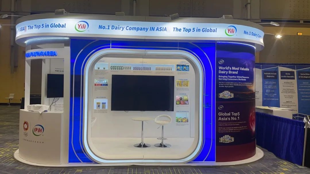
Flashy booth display tactics—LED walls, loud music, gamification, bright colours—work to disrupt the pattern. They trigger a dopamine hit.
However, there’s a diminishing return. High-stimulus environments create what psychologists call "avoidance behaviour." If your booth design looks like a carnival, serious buyers might subconsciously label you as "low tier." It screams effort, and sometimes, looking like you’re trying too hard makes you look desperate.
Plus, in a restricted space, like a 10x10 tradeshow booth, "flashy" quickly turns into "cluttered." You physically cannot fit a laser show and three sales reps in ten square feet without it feeling claustrophobic. If a visitor feels trapped, they won't enter.
The Case for Minimalism
Minimalism isn't about being cheap. It’s about confidence.
When you look at high-end brands, they use space as a luxury. A clean booth setup signals that the product speaks for itself. It lowers the cognitive load for the visitor. They walk past twenty screaming booths and arrive at yours—a quiet, clean oasis. It feels premium.
But here is the risk: Minimalism requires brand equity. If nobody knows who you are, and your booth is just a white wall with a small logo, people might not stop because they literally don't know what you sell. You haven't given them a hook.
I’ve seen companies try to emulate high-end retail designs but forget that those retailers have millions in ad spend backing up that recognition. If you are a mid-sized B2B tech firm, extreme minimalism might just look like you forgot to order your graphics.
The "Goldilocks" Zone
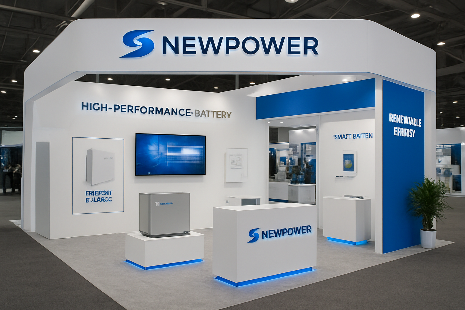
The reality? The most successful booths I see aren't purely one or the other. They use "Functional Minimalism."
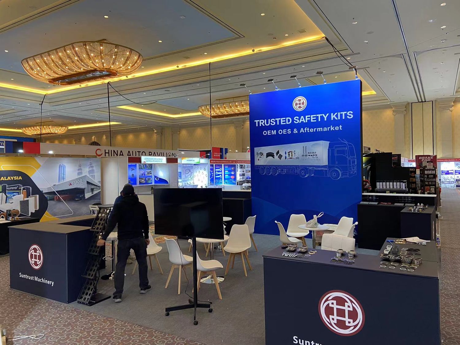
This means the booth display is clean and uncluttered (minimalist), but it uses one single, bold focal point (flashy) to grab attention.
Think about it like a billboard. You have three seconds.
- Who are you?
- What do you do?
- What do I get?
If your booth design is too flashy, the message gets lost in the noise. If it's too minimalist, the message is never broadcasted.
Suggestion: Simplify to Sell
So, how do you actually execute this? If you want ROI, stop trying to win a design award and start building for conversion.
1. Audit Your Space Constraints
If you have a 10x10 tradeshow booth, you are playing a game of inches. Forget the flashy truss systems or massive counters. They act as barricades.
- Suggestion: Go open-concept. Remove the table from the front. Use a clean backdrop with high-contrast lighting. The lighting is your "flashy" element; the layout is your "minimalist" element.
2. The "One Thing" Rule
Your booth display should feature one hero product or message. Not five. Not ten. One.
- Why: If you present three options, people take longer to decide. If you present ten, they walk away. This is the paradox of choice. Use a large, high-quality visual of your flagship offer. That attracts the eye (flashy) but keeps the mind clear (minimalist).
3. Use Colour as a Weapon
You don't need strobes to be flashy. You need contrast. If the expo hall is carpeted in grey (it usually is), and your competitors are using blue (they usually are), use a booth setup that utilises white, yellow, or orange.
- It cuts through the visual noise without looking chaotic.
4. The 10-Foot vs. 3-Foot Read
Design your graphics in tiers.
- The 10-foot read (Flashy): Big headline. "We Cut Costs by 30%."
- The 3-foot read (Minimalist): Clean bullet points or a demo screen that explains how.
The Verdict
Minimalism usually wins on conversion, but Flashy wins on traffic. Since you can't convert traffic you don't have, lean towards bold simplicity.
Don't make them guess. Don't blind them. Just solve their problem, and look good doing it.
References
- Harvard Business Review. (2015). The Science of Sensory Marketing. HBR.org.
- Iyengar, S. S., & Lepper, M. R. (2000). When choice is demotivating: Can one desire too much of a good thing? Journal of Personality and Social Psychology.
- Exhibitor Online. (2023). Trade Show Trends: The Shift Toward Experiential Design.
- Center for Exhibition Industry Research (CEIR). (2022). Report on Attendee Floor Engagement Metrics.


